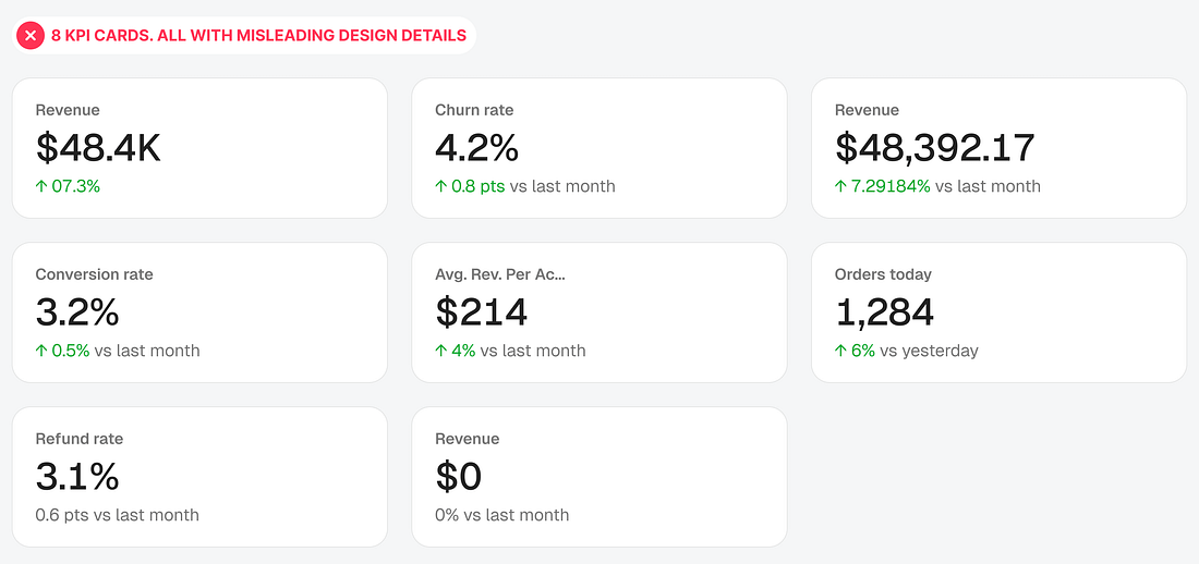
Picking the right KPI card type solves half the problem. The other half lives in the details inside the card. If you miss these design details, your cards will still mislead users.
These errors are easy to miss because they don’t look like errors. A clean number with a clean arrow passes design review every time, since nothing about it looks unfinished. Red flags only show up when someone asks what the arrow is being compared to, or whether green is good news this time.
This article covers eight of these design details: the comparison period, color meaning, number precision, percent versus percentage points, label clarity, data freshness, color-only signals, and empty states...