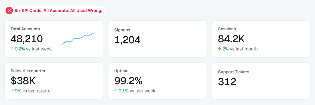
Open almost any dashboard, and you’ll find the same KPI card repeated everywhere: a big number, a small arrow, a percentage. Every metric gets the same treatment, but users usually don’t find it informative.
The reason is that the KPI cards don’t answer the question they’re meant to answer. Sometimes users need to know whether they’ll hit a goal. Sometimes they need to know whether something needs immediate action. A simple stat doesn’t always do the job.
The fix is choosing the right card type based on the question the user is trying to answer. Here are six KPI card types, what each one is for, and what happens when you use the wrong one...