Dear Educator,
CFR Education recognizes that global affairs involves dealing with a lot of complex topics, and visuals can be a powerful tool to help learners quickly grasp those concepts. The right chart in the right place can reveal insights beyond what text alone can. That's why CFR Education integrates visualization into its resources to make complex ideas more accessible, memorable, and impactful. Keep reading to learn how CFR Education uses visuals to deepen learning about: Plus, check out a new activity on mapping Arctic trade routes that touches on economics, foreign policy, and climate change, all while using visuals.
Happy learning, Caroline Netchvolodoff
Vice President, Education
Council on Foreign Relations |
|
|
|
3 Use Cases for Data Visuals |
|
|
Maps to Explain the Partitions by Religion |
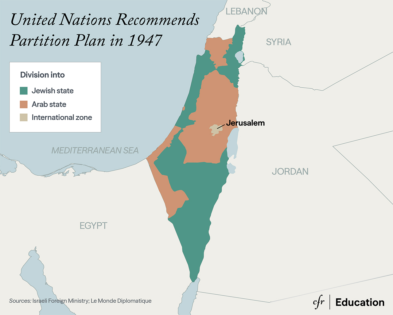
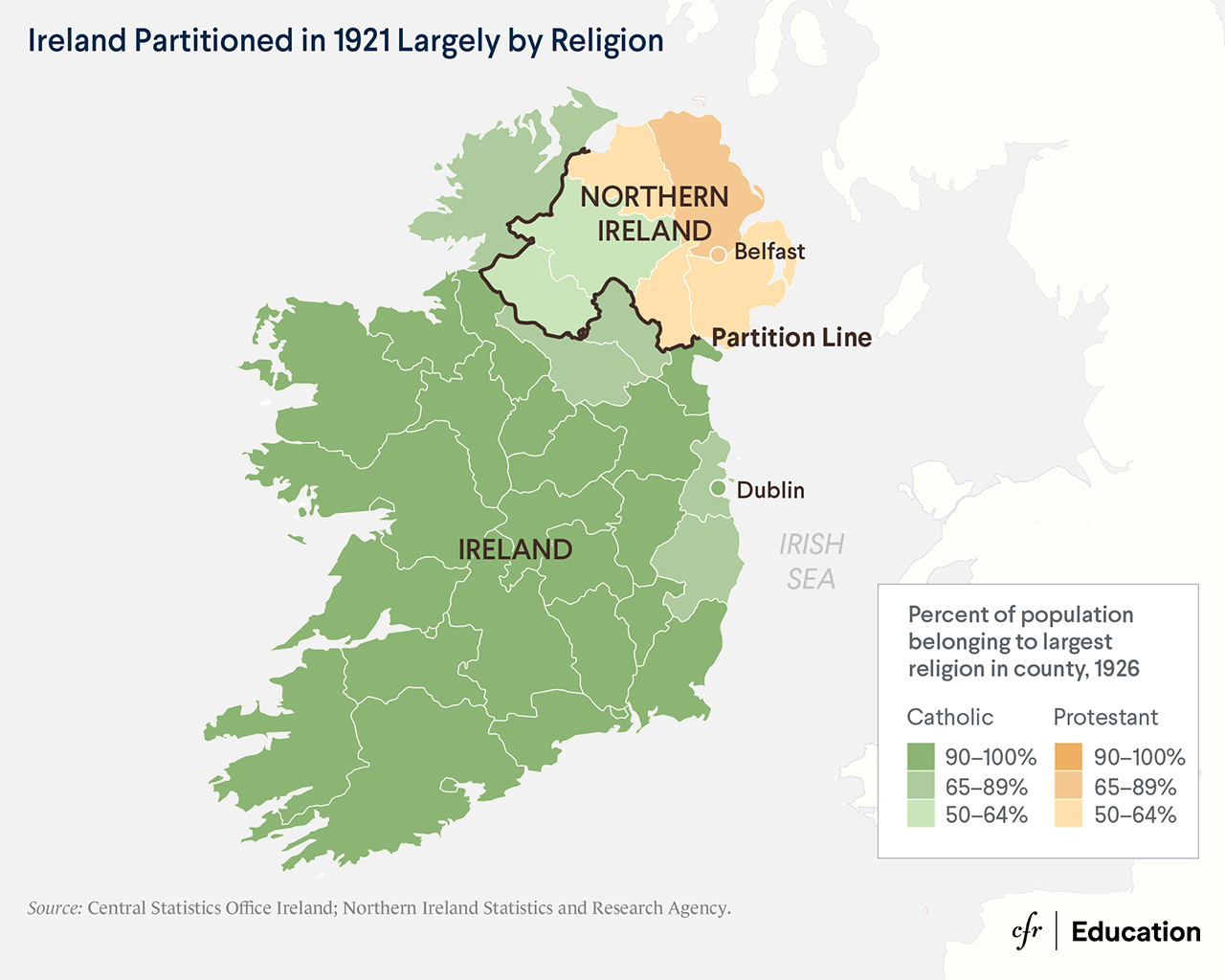
Maps that show physical divisions between people can be an effective way to teach students the reality behind difficult situations. Pairing these visuals with the deeper context provided in timelines or detailed readings helps illustrate the experience of populations divided by political borders.
|
|
|
|
While the impact of borders is very real, they are in fact a political phenomenon. They have been drawn throughout history based on diplomatic, economic, ethnic, or religious concerns. Those borders do not always divide population groups neatly. Borders that seem to arbitrarily divide a population that is otherwise united by ethnic or religious bonds have been consistent sources of tension around the world. |
|
|
|
Graphs that Show Differing Opinions |
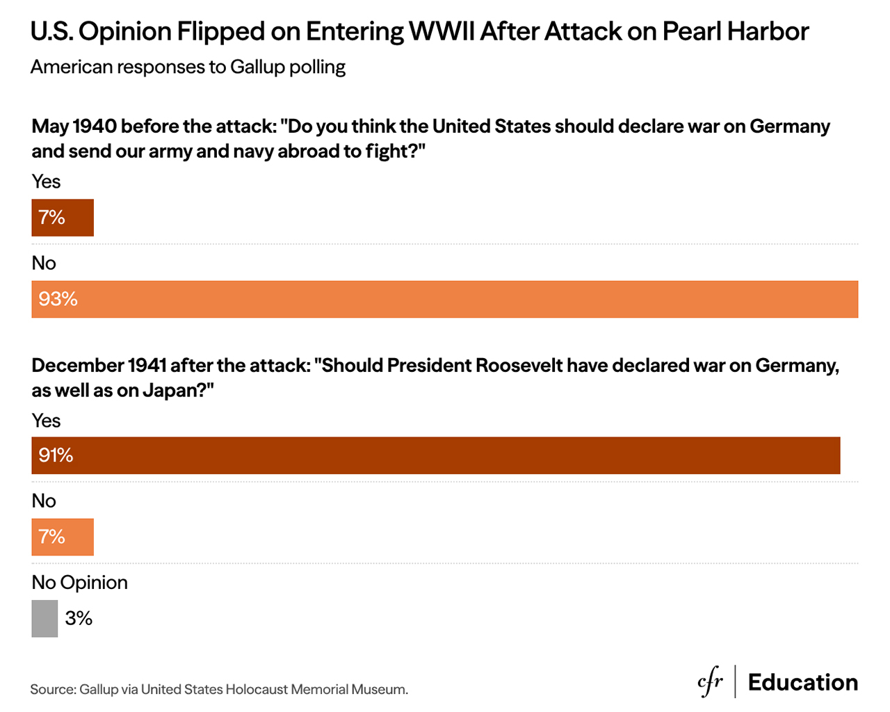
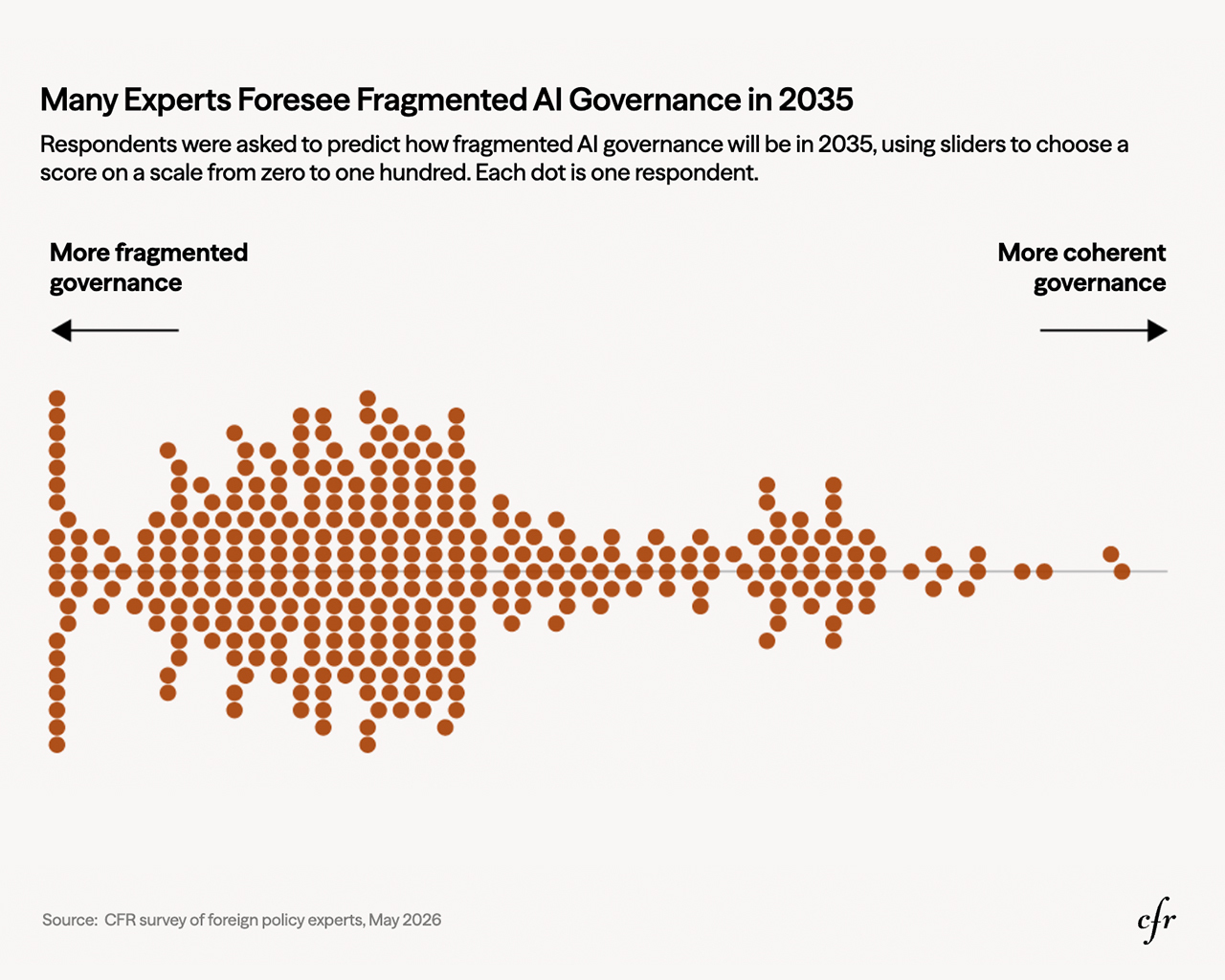
The key to successful civil discourse is acknowledging that a variety of opinions exist. Charts like these can help demonstrate not only the range of opinions but also how opinions can change over time. If American responses about entering WWII can change so drastically over the course of one year, could students see the same thing happening with the public’s response to AI? Ask students to consider what the public experienced between May 1940 and December 1941–not just the actual event of Pearl Harbor but the accumulating news, debates and personal stakes–and brainstorm actions or policies that could shift public opinion on topics such as AI governance.
|
|
|
|
Another way to engage students with specific hypotheticals related to the data is to ask them to consider where they see themselves falling on the spectrum of “more fragmented governance” and “more coherent governance.” Ask them to step into the shoes of policymakers. After analyzing expert survey responses, how would they proceed regarding AI governance?
|
|
|
|
New! Designing Maps and Visuals with Students |
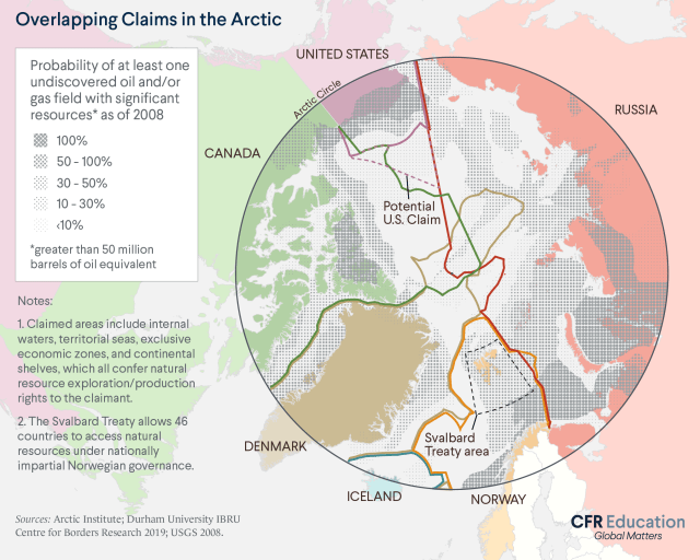
Help students process the complexities of an interconnected world for themselves with this new lesson plans. Students will identify the economic significance of Arctic shipping routes, assess the costs and benefits of Arctic trade, and evaluate the extent to which U.S. policymakers should concern themselves with the Arctic. |
|
| |
|
Charts that Make Students Dive Deeper
|
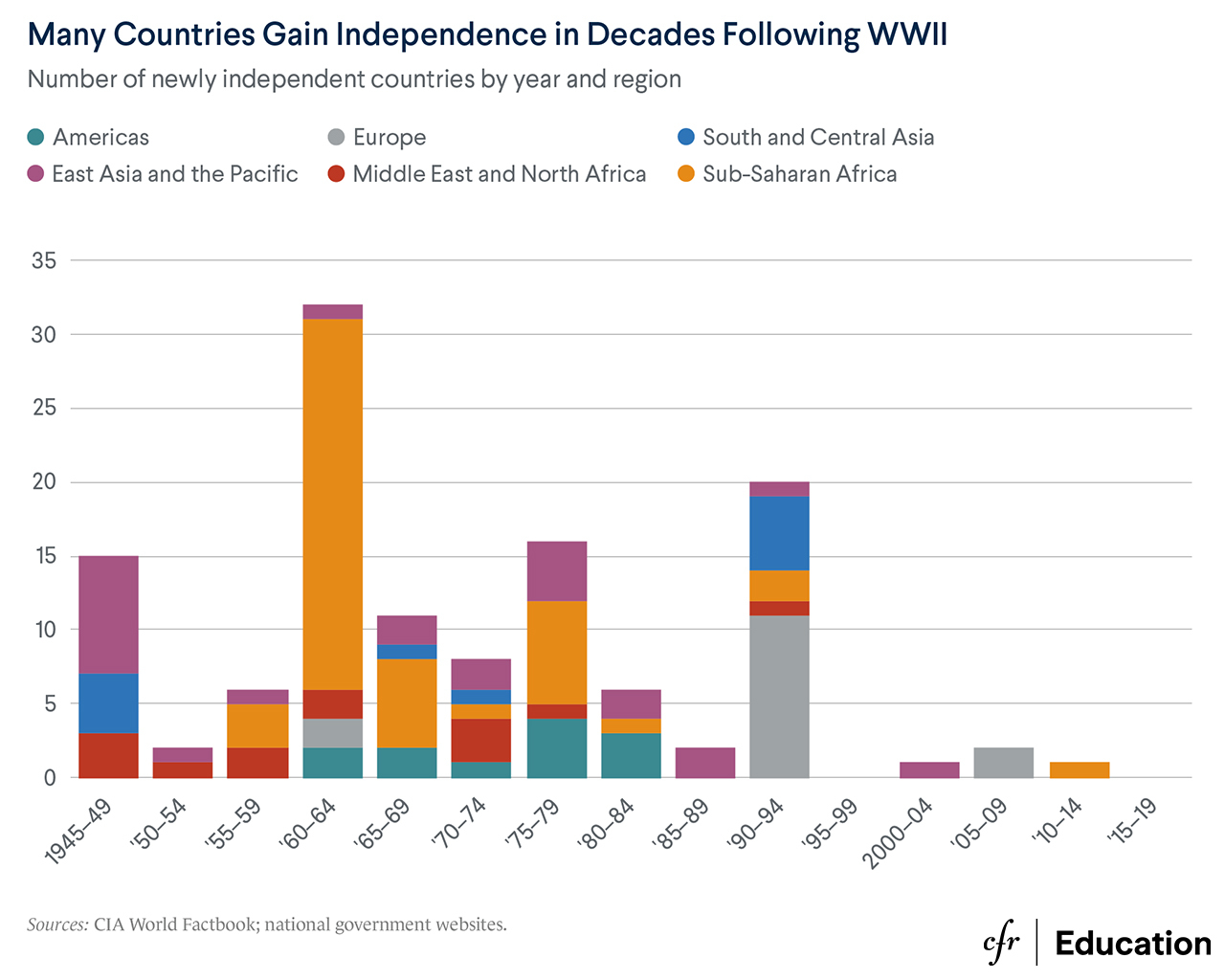
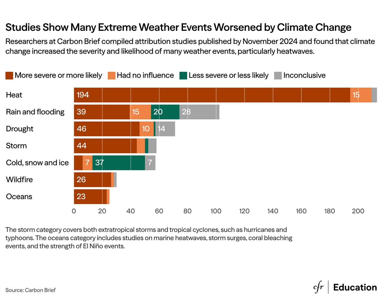
Multilayered charts like these are a great tool for showing students the importance of slowing down and inspecting data to think critically and draw their own conclusions.
The headline "many countries gain independence after WWII" is easy to absorb and move on from, but the stacked colors show that there is more to the story. The towering 1960–64 bar shows that more countries gained independence in that period than any other, but it is the shading of that bar that indicates there is more to investigate. What happened in that region during that time to cause such a spike?
|
|
|
|
The same applies to the graph on extreme weather events. The obvious takeaway is that climate change is worsening extreme weather, but the chart also lets students dig into the data with more nuance.
It shows which types of weather climate change affects, and how confident scientists are about its link to climate change. The bar detailing rain and flooding is a good example of how there is still some uncertainty in the science about how climate change affects extreme weather. The representation of all four colors of the legend can get students thinking about why the uncertainty exists. | |
|
|
58 East 68th Street, New York, NY 10065 |
1777 F Street, NW, Washington, DC 20006 |
|
|
|
|