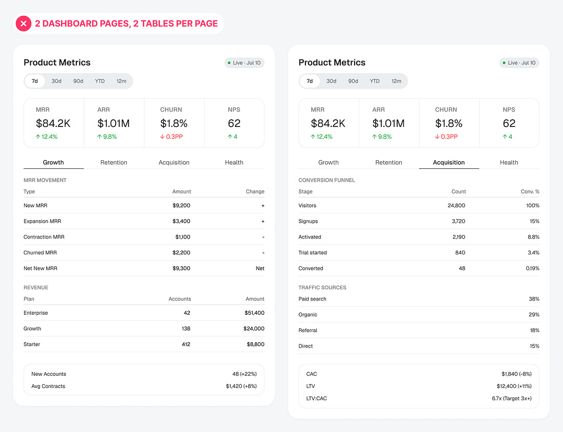
Most dashboard designs display a lot of data. There’s nothing wrong with this if the data is easy to scan and consume. However, it becomes a UX problem when designers rely on multiple tables to display everything.
A table on every page can lead to cognitive overload. Crowded cells and too many rows or columns overwhelm users, making it hard to find key insights. Instead of gathering information at a glance, users have to bury their heads in the fine print to find what they’re looking for.
For instance, look at these two pages on this dashboard. Both display data using two tables per page. It’s not clear where the insights are because the pages are too text-heavy and cluttered. To make key insights clear and easy to find, you need to turn the tables into visual patterns...