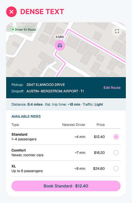
Your interface might look aesthetically pleasing, but that doesn’t mean it’s easy to use. How you display your data plays a huge role in the user experience. Users will either work hard to read dense text or scan effortlessly with visual recognition. The latter is what you should design for.
Here’s an example of an inefficient interface. It looks appealing at first glance, but when users try to use it, they exert a lot of cognitive effort. That’s because dense text forces users to read, while visual data enables them to scan...