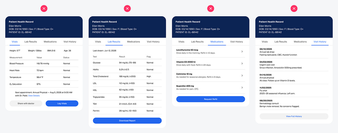
Open any enterprise dashboard, and you’ll see the same problem: dense text and numbers stacked in rows and columns. The data is all there, but nothing is clear. Users have to work to find what matters, and that work adds up over time. The mental effort required to process information is called cognitive load, and it’s what determines the quality of a user experience.
Take a look at this dashboard and how cluttered each page is. The current design requires close reading and meticulous scrutiny. One mistake or misinterpretation of the data can lead to patients receiving improper or negligent care. It’s harder to make decisions and take actions under such a high cognitive load.
Redesigning a high-cognitive-load dashboard isn’t about reducing the amount of data, but about restructuring how it’s presented. The goal is to help the brain process information in quick glances rather than close reads. To do this, you need to identify what’s overloading your dashboard and design for faster recognition...