|
Every UI does something in common—they display a collection of items for users to interact with. It’s not easy to know where to look first when every item is the same size, shape, and color. As a result, more time and effort are required to complete tasks.
That’s where visual hierarchy comes in. It’s the art of making the most important things stand out, while letting everything else stay out of the way until users need it. Every item stops competing for attention, so that users can find relevant information faster.
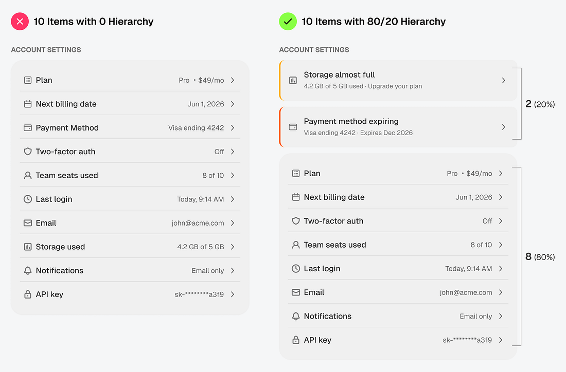 |
The 80/20 rule makes creating visual hierarchy easier. It states that only 20% of a collection needs to be front and center. The other 80% can be hidden behind a click or minimized in a list...

