|
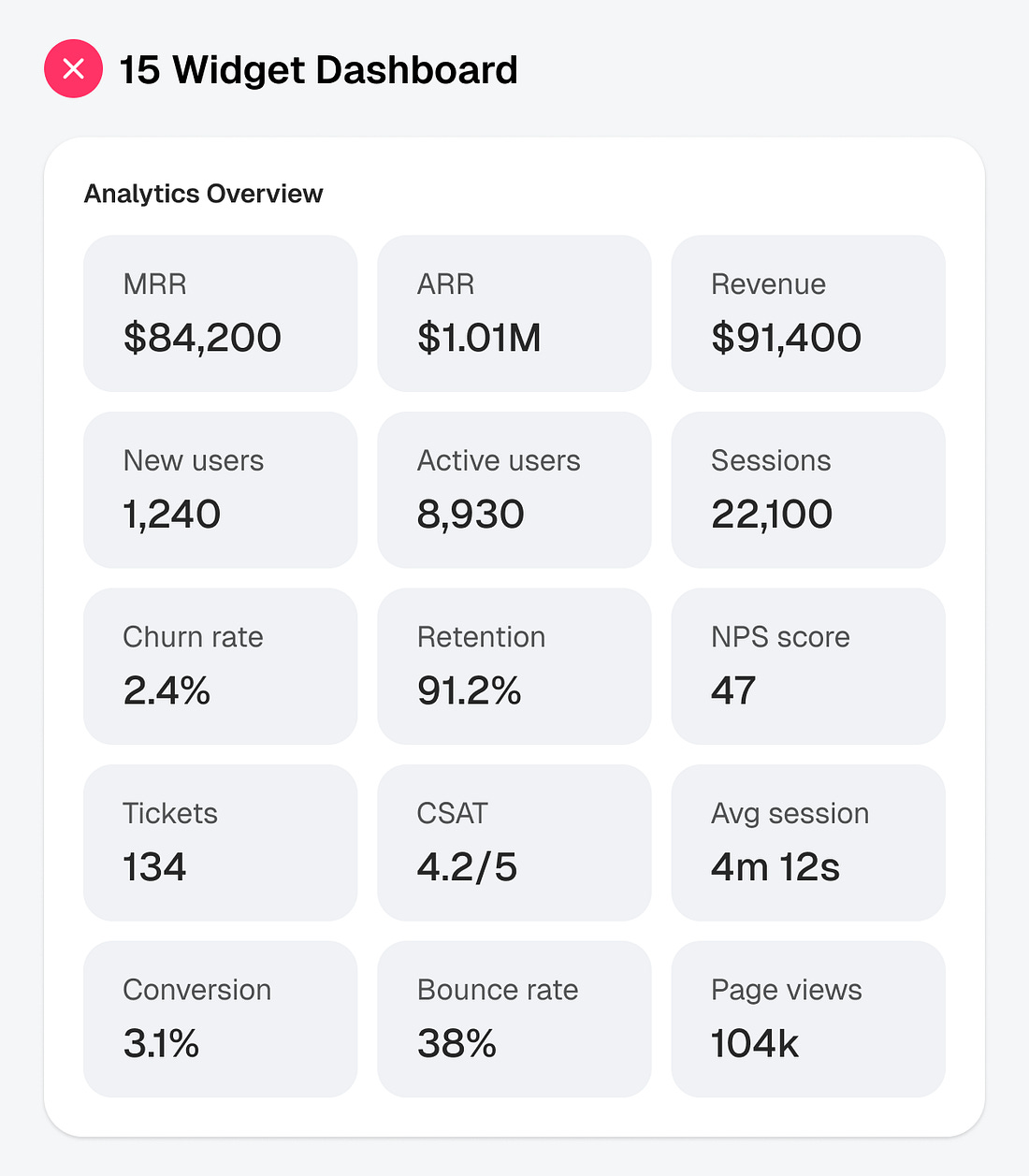
Imagine opening an app to check how much money you made this month. Instead of seeing that number, you see 15 boxes. All the same size. All fighting for your attention at once. Where do you look first? Most users don’t know.
They either read every box one by one or they give up and close the app entirely. Either way, the dashboard failed them. The problem with most SaaS dashboards today isn’t that they show too much information, but that they treat every piece of data like it’s equally important.
 |

Continue reading this post for free in the Substack app
