|
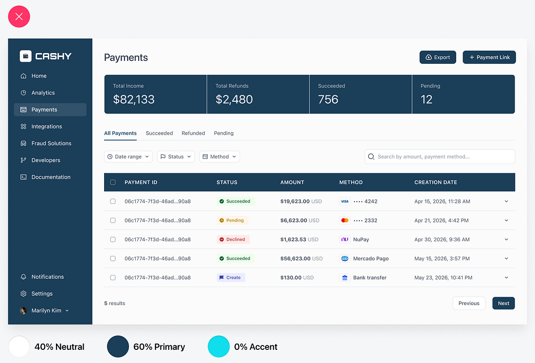
Is your user interface ugly? Unfortunately, it is if it lacks the 60/30/10 color ratio. Without this essential balance, users won’t perceive your app as intuitive to use. Not only that, but you also won’t be able to justify charging a premium price for it. Ugly UIs end up costing you more than you realize.
Using the Primary Color Everywhere
For example, this app has very poor aesthetics because it doesn’t follow the 60/30/10 color ratio:
60% Neutral Colors for Space
30% Primary Color for Identity
10% Accent Color for Action
 |
