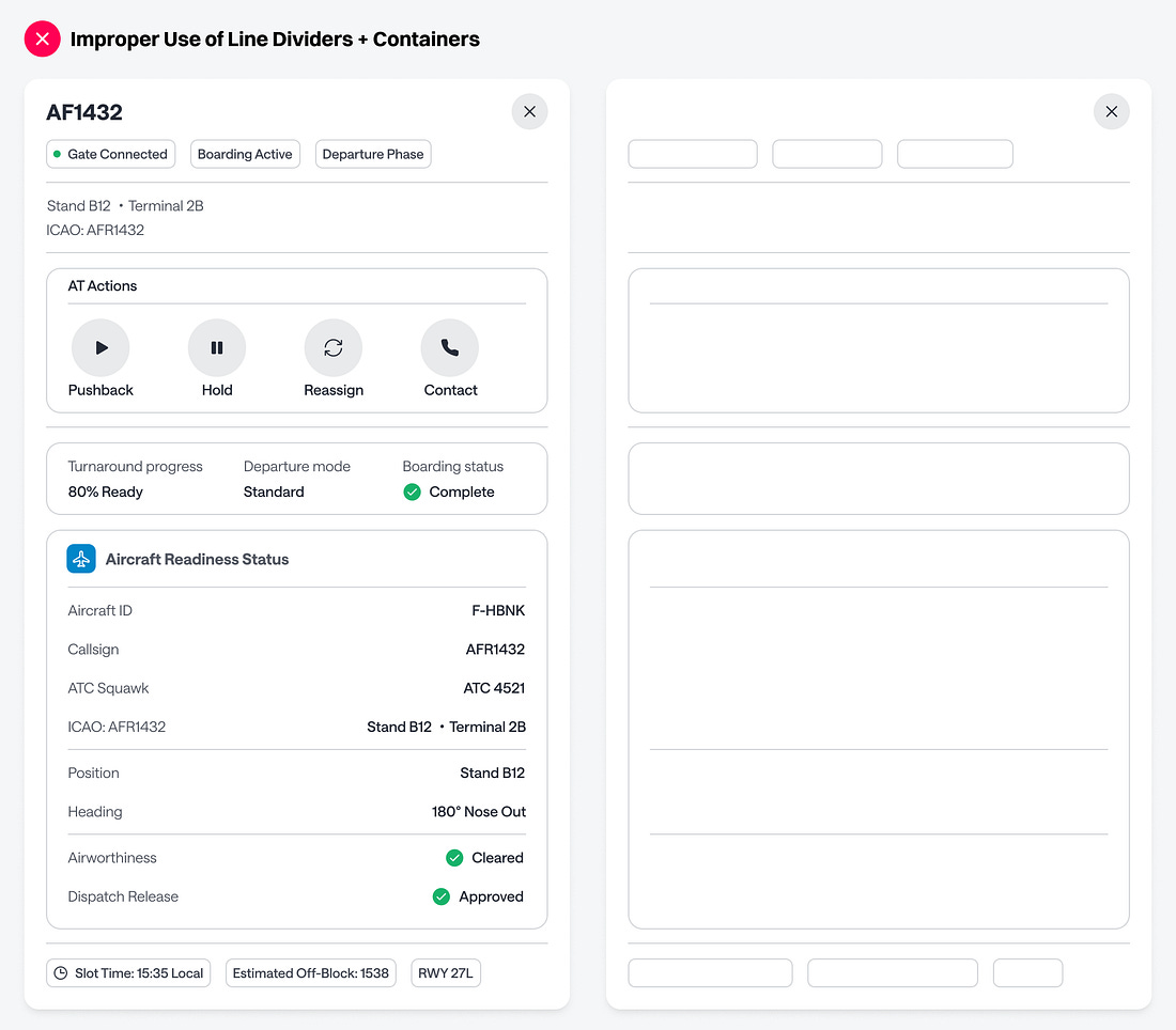
Organizing data on a screen is harder than it looks. Without structure, users will struggle to scan and process information efficiently. Most designers know this, so they add line dividers and containers to their design. However, they often misuse these elements, making their interface harder to read and understand.
Look at how many dividers and containers can end up in a single layout. When there are almost as many structural elements as there are pieces of data, the result is clutter. Instead of guiding the eye, all those lines create visual noise that gets in the user’s way.