90% of judgments happen in 90 seconds. Here's the formula designers use.
 ‍͏  ͏  ‍͏  ͏  ‍͏  ͏  ‍͏  ͏  ‍͏  ͏  ‍͏  ͏  ‍͏  ͏  ‍͏  ͏  ‍͏  ͏  ‍͏  ͏  ‍͏  ͏  ‍͏  ͏  ‍͏  ͏  ‍͏  ͏  ‍͏  ͏  ‍͏  ͏  ‍͏  ͏  ‍͏  ͏  ‍͏  ͏  ‍͏  ͏  ‍͏  ͏  ‍͏  ͏  ‍͏  ͏  ‍͏  ͏  ‍͏  ͏  ‍͏  ͏  ‍͏  ͏  ‍͏  ͏  ‍͏  ͏  ‍͏  ͏  ‍͏  ͏  ‍͏  ͏  ‍͏  ͏  ‍͏  ͏  ‍͏  ͏  ‍͏  ͏  ‍͏  ͏  ‍͏  ͏  ‍͏  ͏ ͏‌ ­ ­ ­ ­ ͏‌ ­ ­ ­ ­ ͏‌ ­ ­ ­ ­ ͏‌ ­ ­ ­ ­ ͏‌ ­ ­ ­ ­ ͏‌ ­ ­ ­ ­ ͏‌ ­ ­ ­ ­ ͏‌ ­ ­ ­ ­ ͏‌ ­ ­ ­ ­ ͏‌ ­ ­ ­ ­ ͏‌ ­ ­ ­ ­ ͏‌ ­ ­ ­ ­ ͏‌ ­ ­ ­ ­ ͏‌ ­ ­ ­ ­ ͏‌ ­ ­ ­ ­ ͏‌ ­ ­ ­ ­ ͏‌ ­ ­ ­ ­ ͏‌ ­ ­ ­ ­ ͏‌ ­ ­ ­ ­ ͏‌ ­ ­ ­ ­ ͏‌ ­ ­ ­ ­ ͏‌ ­ ­ ­ ­ ͏‌ ­ ­ ­ ­ ͏‌ ­ ­ ­ ­ ͏‌ ­ ­ ­ ­ ͏‌ ­ ­ ­ ­ ͏‌ ­ ­ ­ ­ ͏‌ ­ ­ ­ ­ ͏‌ ­ ­ ­ ­ ͏‌ ­ ­ ­ ­ ͏‌ ­ ­ ­ ­ ͏‌ ­ ­ ­ ­ ͏‌ ­ ­ ­ ­ ͏‌ ­ ­ ­ ­ ͏‌ ­ ­ ­ ­ ͏‌ ­ ­ ­ ­ ͏‌ ­ ­ ­ ­ ͏‌ ­ ­ ­ ­ ͏‌ ­ ­ ­ ­ ͏‌ ­ ­ ­ ­ ͏‌ ­ ­ ­ ­ ͏‌ ­ ­ ­ ­ ͏‌ ­ ­ ­ ­ ͏‌ ­ ­ ­ ­ ͏‌ ­ ­ ­ ­ ͏‌ ­ ­ ­ ­ ͏‌ ­ ­ ­ ­ ͏‌ ­ ­ ­ ­ ͏‌ ­ ­ ­ ­ ͏‌ ­ ­ ­ ­ ͏‌ ­ ­ ­ ­ ͏‌ ­ ­ ­ ­ ͏‌ ­ ­ ­ ­ ͏‌ ­ ­ ­ ­ ͏‌ ­ ­ ­ ­ ͏‌ ­ ­ ­ ­ ͏‌ ­ ­ ­ ­ ͏‌ ­ ­ ­ ­ ͏‌ ­ ­ ­ ­ ͏‌ ­ ­ ­ ­ ͏‌ ­ ­ ­ ­ ͏‌ ­ ­ ­ ­ ͏‌ ­ ­ ­ ­ ͏‌ ­ ­ ­ ­ ͏‌ ­ ­ ­ ­  

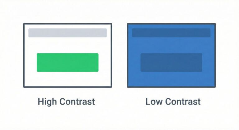
Hello there,

People judge your site in 90 seconds.

Up to 90% of that decision is based on color alone.

That's a lot riding on something most of us were never trained to do.

Here's what I've noticed: Most pick colors they like, not colors that convert. The site looks fine. But the call-to-action button? It blends right into the header.

Professional designers use a simple formula called 60-30-10.

60% neutral background. 30% brand color. 10% accent for your CTAs.

That's it. No guesswork. No endless tweaking.

A bright green button on white will outperform a "psychologically perfect" blue button that disappears into a blue header. Contrast wins every time.