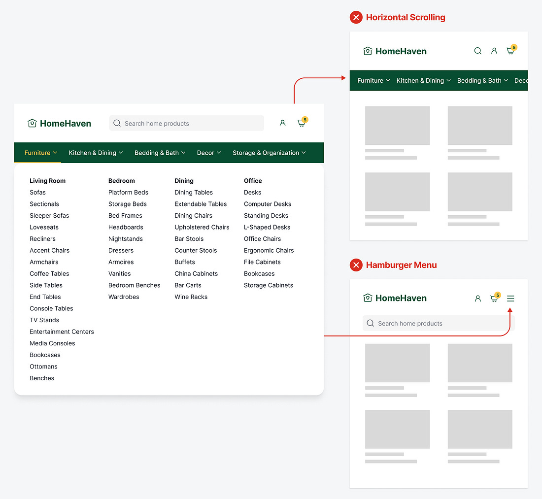
Do you have a massive menu on your desktop app? Unfortunately, that navigation won’t fit on mobile screens. As a result, your mobile users won’t have a pleasant experience navigating your app.
A common approach is to allow menu items to bleed off the edges so users can scroll horizontally to navigate. However, this isn’t intuitive because not all users will perceive the horizontal scroll function and may only interact with the visible items.
Also, horizontal scrolling and scanning require more effort with the finger and eyes. It’s much harder for users to scan and scroll a list horizontally than vertically. The movement feels more awkward as it goes against the downward direction of the page flow.
