|
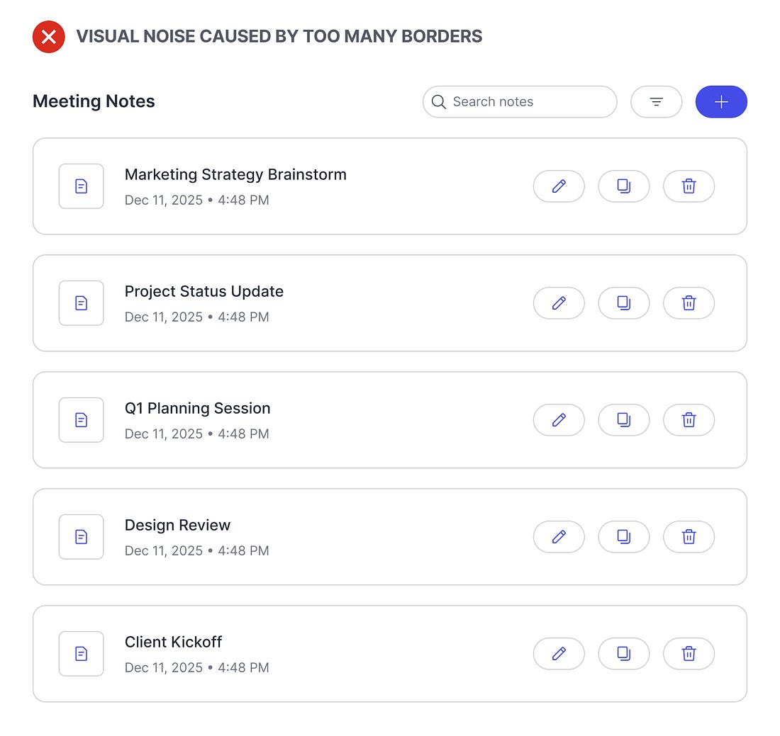
There’s a bad design practice you might not know you’re doing. It’s so subtle that most designers aren’t aware of this problem. Using too many borders is hurting your user interface.
When you have borders within borders, there’s more visual noise that interferes with the user’s viewing experience. The borders are harsher on the eyes and become a distraction as users scan for information. Not only that, but the UI looks less like a finished design and more like an incomplete wireframe.
 |

Continue reading this post for free in the Substack app
![]()
![]()