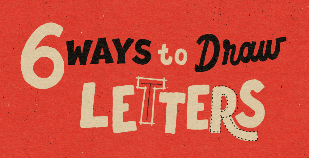
Break the Mould: 6 Ways to Draw Letters When You're Stuck in a Rut |
|
Tired of seeing the same letterforms every time you sit down to draw? I know the feeling.
In this email, I'm giving you six practical techniques to build and refine your letters with greater speed and precision. From mastering the underlying 'skeletal' structure to using grids for consistency, you'll learn how to draw smarter, not just harder and hopefully make you more efficient.
Grab your iPad and let's go! |
This technique ensures your letters have a solid foundation before you worry about adding thickness.
➡️ The Process: Define the Core: Start by drawing a single-line skeleton of your word (this can be block, script, or anything in between, like the example "GREAT").
Add Weight: Create a new layer above the sketch. Draw around the skeleton to add the letter thickness, focusing on keeping a consistent distance between your outer edge and the central skeletal line.
✅ Why This Technique Works:
⚠️ Watch Out For: Overlapping: You must deliberately over-space your initial skeleton sketch. If you don't, when you add the weight, the letters will overlap with the adjacent letter, leading to illegibility and wasted time on corrections.
|
2. Components: Building with Repeatable Shapes |
|
Instead of drawing the whole letter at once, try focusing on building it piece-by-piece using simple, repeatable geometric shapes.
➡️ The Process: Focus on constructing the letter by using its individual, basic shape components. For instance, you could see the letter 'E' as one vertical rectangle and three horizontal rectangles. You have two options: Draw each required shape individually. Draw just one component (e.g., the vertical stem) and then copy, paste, and rotate it to assemble the remaining parts of the letter.
✅ Why This Technique Works: This method removes the overwhelm of trying to draw perfect letters by treating them as assemblies of simple shapes. By defining the thickness of your components (rectangles, circles, etc.), you automatically define the weight of the whole letter, making it much easier to tackle complex forms and get started quickly.
⚠️ Watch Out For: Inconsistent Weight: It can be extremely challenging to maintain consistent weight from one letter to the next, particularly if you are drawing all the components freehand. This challenge is magnified in words that mix straight (rectangular) and curved (circular) components, as the visual weight needs manual balancing.
|
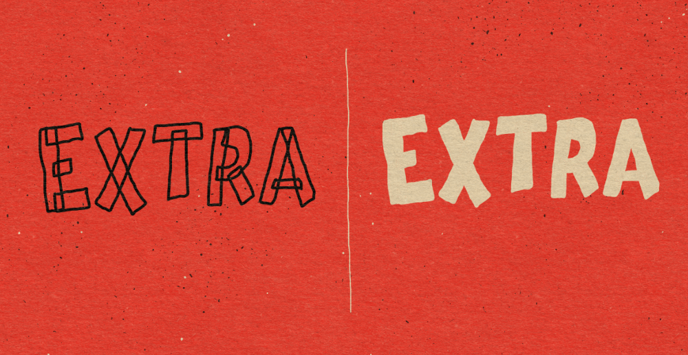
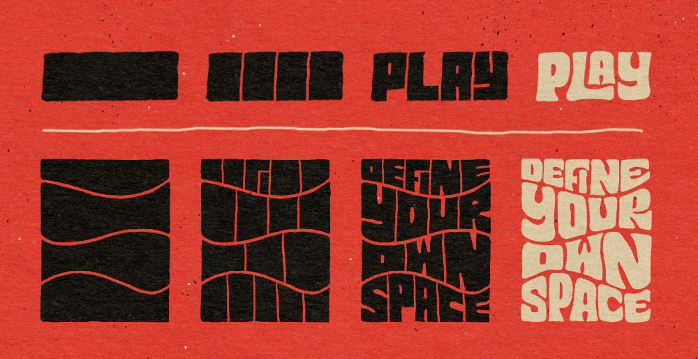
3. Erase: Using Negative Space |
|
This approach flips the traditional drawing method, using subtraction with the eraser tool to achieve clean, defined edges and consistency.
➡️ The Process: Block it Out: Start by drawing a simple, solid block or shape that spans the entire width of your word (like the "PLAY" example). Segment: Divide the block roughly into segments, one for each letter in your word. Rough Carve: Using the eraser tool, begin to carve out your letterforms. Focus on removing the major negative spaces. Refine and Connect: Go back in to refine the edges and look for opportunities where adjacent letters can creatively interact or overlap.
✅ Why This Technique Works: Precision by Subtraction: It's often easier and faster to define a clean, geometric edge using the precision of the eraser tool than by trying to freehand draw the positive shape.
Unique Forms: This technique instantly helps you create unique, graphic shapes and consistent negative space, immediately breaking you out of a creative rut caused by drawing letters traditionally.
⚠️ Watch Out For: Style Constraints: This method is often heavily associated with a playful, retro, 70s vibe. Due to the inherent thickness of the letterforms, it may not translate well to other, thinner styles.
Construction Knowledge: You need to have a foundational understanding of letter construction to know exactly which parts of the solid block need to be erased to maintain legibility.
Frustration Point: It can become frustrating when a particular letter resists adhering to the style or looks illegible, requiring significant patience and revision.
|
4. Brushes: Quick Construction & Refinement |
|
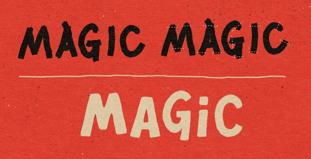
This method uses a simple brush to rapidly lay down the bulk of your letterforms, drastically speeding up the initial drawing phase.
➡️ The Process: Block-In (The Quick Part): Select a thick, square, or simple custom brush (I like to use Rock and Roller from the Freestyler set). Use this brush to quickly and easily block in the overall shape and weight of your letterforms (as shown with the "MAGIC" example). Don't worry about perfect edges yet.
Refine (The Tidy Part): Switch to a thinner brush with a similar texture. Go back in to tidy up the outlines, corners, and joins, creating consistent, finished edges across the word.
✅ Why This Technique Works:
⚠️ Watch Out For: Maintaining Consistency: If you are too loose in the block-in phase, you may end up with wildly inconsistent letterforms and spacing, requiring extensive cleanup. Keep your initial letterforms looking steady and consistent.
The Over-Refine Trap: Remember that the goal is efficiency. Don't spend so much time on the cleanup phase that you negate the time you saved by blocking in the letters quickly!
|
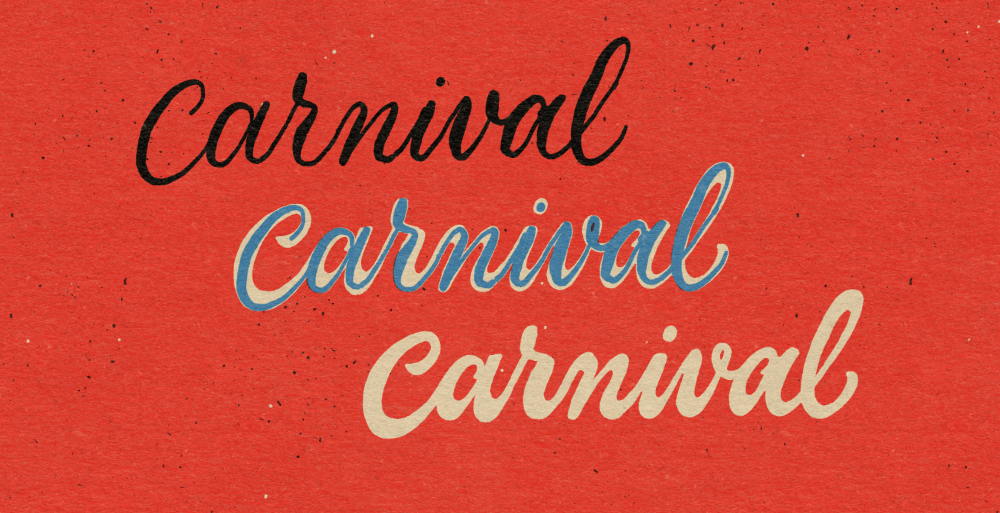
5. Building on Calligraphy |
This technique uses the rhythm of traditional script to quickly map out the perfect flow and structure for a finished, weighted brush-style letter.
➡️ The Process: Map the Flow (Thick/Thins): Start by using a pressure-sensitive brush to write down the word using the thick and thins of script calligraphy (as seen in the top "Carnival" example). This instantly defines the fluid speed and angle of your final piece.
Build the Weight: Use the calligraphic strokes as your guide. Create new outlines to build up the weight of the letters around the existing thin lines, resulting in a finished letterform that looks more brush script (as seen in the middle and bottom examples).
✅ Why This Technique Works:
⚠️ Watch Out For: |
6. Grids: The Consistency Solution |
|
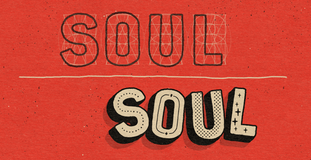
Maintaining uniformity in size, width, thickness, and style is the hardest and slowest part of any lettering project. Using grids like my product LetterBuilder helps with this part of the process.
➡️ The Process: The Setup: Draw out one grid per letter of the word you'll be creating.
Trace and Build: On a new layer draw out each letter using the grids to guide you. This will give you an initial starting point on which to build upon.
Add your Style: Now with the basic letter structures, you can add decoration with your own creative style.
✅ Why This Technique Works: Consistency Guaranteed: These grids solves the common lettering problem of inconsistency. You avoid the hours of manual measuring, guaranteeing that the size, width, and thickness are perfect from Letter A to Z.
Time Saver: You no longer need to figure out the basic structure for every letter, allowing you to focus all your time and creative energy on adding your own unique style and finesse. [Get consistent outlines instantly with Letter Builder here]
⚠️ Watch Out For: Just a Starting Point: Don't treat the grid as the finished product! It's merely the starting framework for consistency. If you leave the letters untouched, they can look mechanical and dull. Use the perfect structure as a springboard for your decoration and customisation.
Optical Alignment: Even with perfect guides, you still need to manually balance the optical weight. For example, rounded letters (like 'O' or 'S') sometimes need to sit slightly below the baseline to appear visually aligned with straight letters (like 'H' or 'L').
The Guide is Not the Boss: The grid is your guide, not your ruler. If a letter looks awkward but technically follows the rules, trust your eye and make a subtle adjustment.
|
I hope these techniques spark some fresh ideas for you! Remember, drawing letters is supposed to be fun, and these steps are here to make the process easier and less frustrating.
Which technique are you excited to try first? Let me know!
Ian | | | |