|
A DTC or eCommerce brand pretty website without good copy is like Chuck Norris without a beard. Technically capable, but strategically blind.
You see, your website isn’t failing because of design. It’s failing because it’s politely safe. Time to inject some fuego into your words—and turn more scrolls into checkouts.
I have ONE homepage rewrite slot for November. Upgrade your persuasion fuego🔥 — or keep serving as your competitors’ conversion funnel. email me: miguel@teardwn.com
Picture this. 1980s America. Televangelists on TV. Drugs in the clubs. Disco still clinging on. A generation dabbling in self-help and psychedelic residues of the 60s.
Religion, by then, had a serious “brand problem.”
It was either sanctimonious finger-wagging on TV. Or fringe cults demanding your worldly possessions.
Now suppose you ran the Episcopal Church in that era. And you wanted to make the Episcopal Church be seen as sane, modern, and—most importantly—worth a try. What would you do?
In 1979, Reverend Dr. George H. Martin, an Episcopal pastor in Minneapolis, felt it was time to try something new.
He thought, "You can use contemporary language to communicate about God."
Reverend Martin wanted to invite more people to join the Episcopal Church.
Advertising seemed like a good place to start. So he asked adman Tom McElligott for help.
Tom happened to be a practicing Episcopalian. And Tom was one of the founders of Fallon McElligott Rice, a tiny new ad agency in Minneapolis. So, naturally, they needed attention—fast.
Long story short Tom agreed to help.
For six years, Reverend Martin worked with Tom and Nancy Rice at Fallon McElligott Rice.
During that time, the agency churned out a string of bold, provocative print ads that brought a lot of attention to the church.
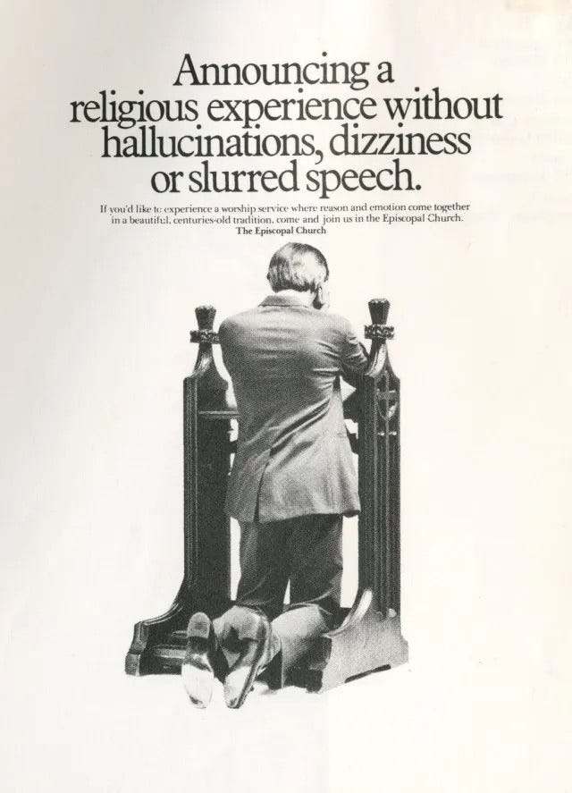
In 1986, the Episcopal Church ran an ad that would have looked more at home in the back pages of Rolling Stone than in a Sunday service leaflet.
The headline? “Announcing a religious experience without hallucinations, dizziness or slurred speech.”
Why was it genius?
It flipped expectations and reframed Sunday service as the sober choice. Everything else? Pure theatrics: hallucinations, dizziness, slurred speech.
And suddenly, the thing you thought was boring—quiet prayer, modest hymns, calm sermons—looked rational, refreshing, even attractive.
Nothing sells like contrast. Frame the alternative as ridiculous, and suddenly your choice shines.
 |
㋡㋡㋡㋡㋡㋡㋡㋡㋡㋡㋡㋡㋡㋡㋡㋡㋡㋡㋡㋡㋡㋡㋡㋡㋡㋡㋡㋡㋡㋡㋡㋡㋡㋡
Dangerous Ideas:
1/ Sell the benefit by comparing and contrasting it with a bad alternative.
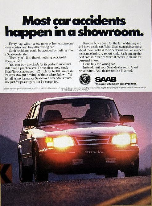
Saab used to get it in the mid 1980s. In 1989 they knew how to sell the benefit “You can buy a Saab for the fun of driving and still have a safe car”. And how did they sell it? By contrasting Saab with a bad alternative ⇝ “Most car accidents happen in a showroom”.
 |
2/ In a World where every brand promises the same things, Illogical and brave always beats mediocre but safe ideas.
Classic Snickers from 10 years ago. Straight out of South Korea. Still weirdly brilliant.

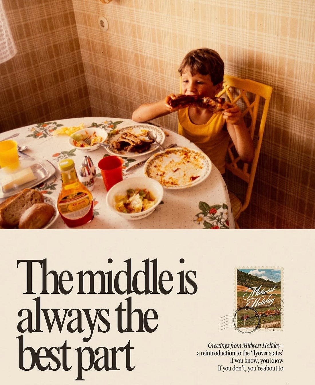
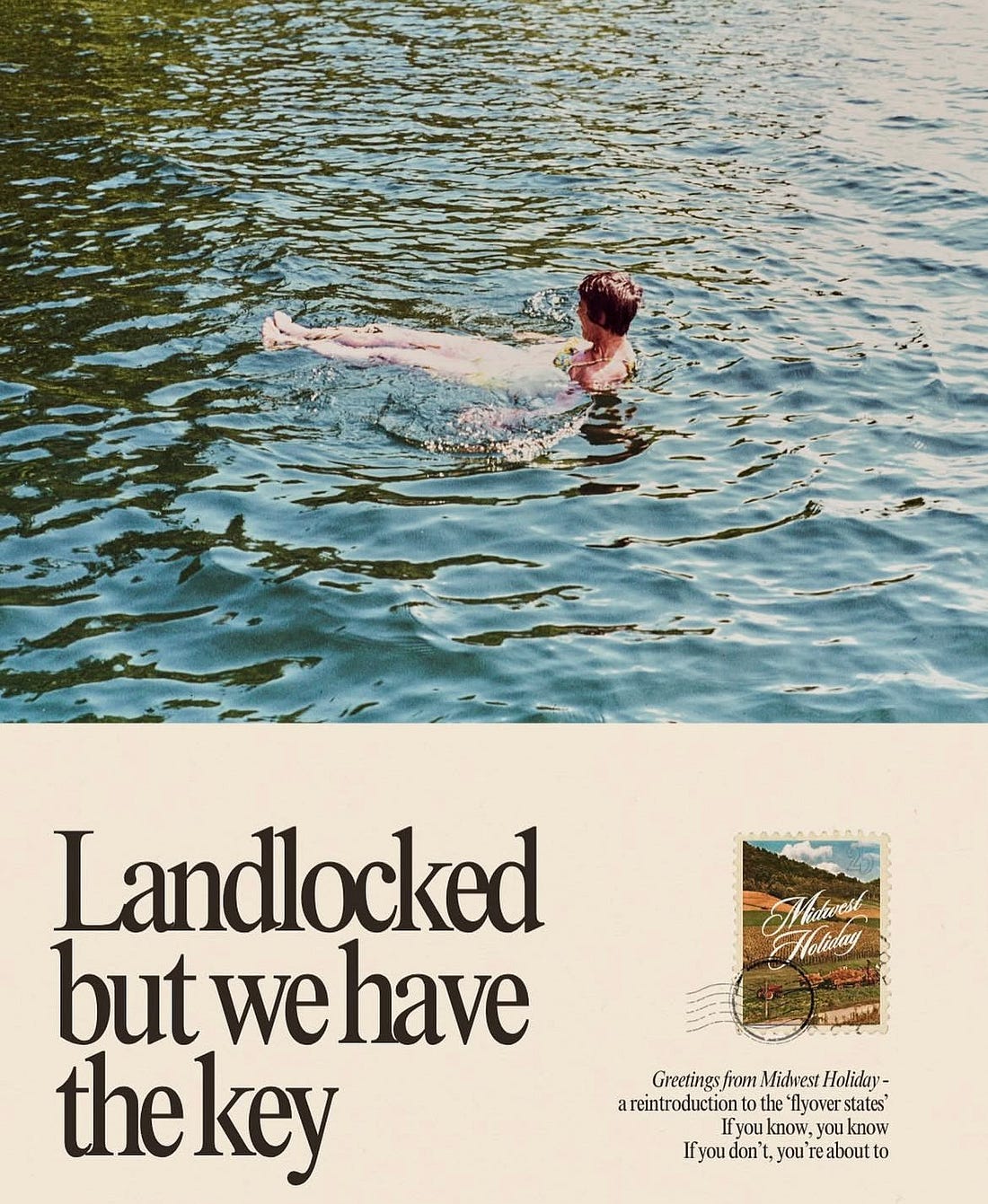
3/ To sell something old, make it feel new.
Midwest Holiday (a travel venture in the US) gets it. Its mission? Show the Midwest as a place to slow down, but still find adventure. Love the copy and vintage vibes.
 |
 |
PS. Because a website without good copy is like Chuck Norris without a beard. Powerless. Unnatural. A tragedy. Let’s fix that. I have ONE homepage rewrite slot for new projects starting after November 9th. But don’t email me - unless you take copywriting seriously.
Your pal,